
Have you ever thought about how to use colors to create minimalist and cozy environments without compromising visual lightness?
Many people associate minimalism with cold, overly neutral, and sometimes unwelcoming spaces. However, the right choice of color palette can completely transform this perception, creating interiors that balance elegance, simplicity, and comfort.
In this article, you will learn effective techniques and combinations to apply colors strategically, building minimalist environments that are welcoming, promote well-being, and reflect a more conscious lifestyle.
The Importance of Colors in Minimalist Design
In minimalist design, every element is chosen with intention—and colors are no different. They play a fundamental role in creating cozy, balanced, and visually harmonious environments.
Beyond Aesthetics
Colors directly influence emotions, well-being, and even the perception of space. When applied sensitively, they can soften the typical sobriety of minimalism and provide a warmer and more inviting atmosphere.
A well-colored minimalist environment doesn’t lose its simplicity—on the contrary: the conscious choice of tones enhances elegance and creates a space that breathes serenity.
Avoiding Excessive Coldness
One of the risks when creating minimalist interiors is ending up with spaces that convey rigidity or impersonality. The total absence of color, when not balanced with textures or natural materials, can make the environment unwelcoming.
This is precisely where the strategic use of colors comes in: they soften, warm, and create depth, helping to transform minimalism into an experience of comfort and well-being.
How to Choose the Ideal Color Palette for Minimalist Environments
Choosing the right color palette is essential for creating minimalist environments that are not only elegant but also welcoming. The foundation of minimalism is neutral and soft tones, but this doesn’t mean monotony. The secret lies in the balanced combination of sobriety, texture, and, when appropriate, touches of color.
Neutral Tones: White, Beige, Sand, and Light Gray
Neutral tones are the backbone of any minimalist environment. They create a sense of spaciousness, brightness, and lightness. Additionally, they are highly versatile, serving as a base for incorporating textures and natural elements.
- White: expands and reflects light, essential for small spaces.
- Beige and sand: add warmth and softness, avoiding excessive coldness.
- Light gray: conveys sobriety and elegance, working well in furniture and finishes.
Choosing a neutral palette favors visual continuity and provides a calmer, more organized environment.
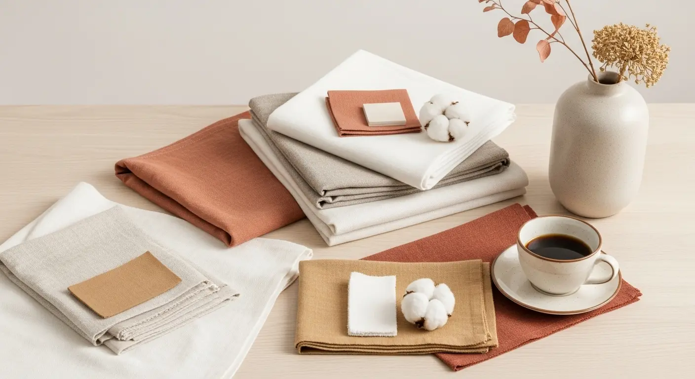
Earthy Palettes: Warmth and Connection with Nature
Earthy colors—such as terracotta, caramel, clay, and shades of dry green—are perfect for adding coziness to the minimalist space while maintaining the proposal of simplicity and connection with natural elements.
These colors evoke feelings of warmth, stability, and a sense of welcome, making them ideal for details in furniture, decorative objects, or textiles.
Touches of Color: When and How to Add Harmoniously
Although minimalism favors sobriety, it is possible—and recommended—to add pops of color sparingly and intentionally.
The rule is simple: less is more. Choose one or two complementary colors, applied in small areas, such as:
- Pillows
- Minimalist paintings
- Vases or artisanal objects
- Throws and rugs
The secret lies in moderation: these additions should create visual interest without breaking the unity and flow of the environment.
Strategies for Creating Cozy Environments with Colors
Creating a minimalist environment doesn’t mean giving up comfort and warmth. The secret lies in how to use colors with intelligence and sensitivity, leveraging their ability to transform feelings and perceptions.
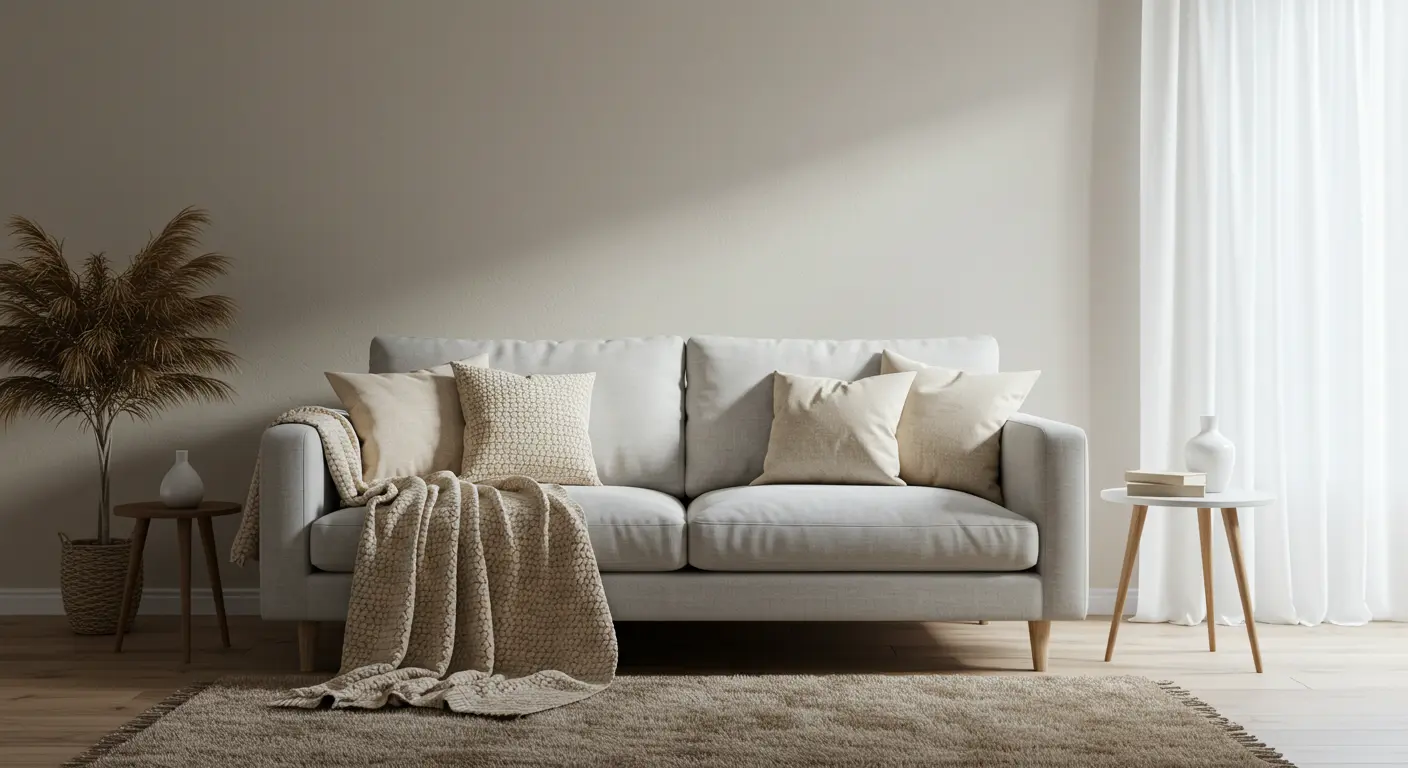
Layering Soft Tones
Layering neutral and soft tones is one of the main techniques for creating a cozy and sophisticated space. Combining different nuances of white, beige, sand, or light gray results in visual depth without compromising lightness.
For example, an off-white sofa with beige pillows and a light gray throw creates a harmonious and welcoming composition, perfect for minimalist spaces.
Using Textures that Complement the Palette
Besides colors, texture is an essential element to enhance coziness. Materials like linen, light wood, or natural fibers enrich the composition and prevent the space from feeling cold or impersonal.
If you want to delve deeper, also check out our article on Textures and Materials in Minimalist Design that Bring Visual Comfort, with practical tips for creating sensory and welcoming environments.
Texture provides contrast and coziness, even when the palette consists exclusively of light and cool tones.
Monochromatic Combinations and Their Visual Power
Monochromatic palettes are common in minimalism and can be extremely welcoming if worked with subtle variations in tone and texture.
For example: a room entirely in shades of gray can be sophisticated and inviting if it includes:
- Soft fabrics
- Textured rug
- Matte walls
- Furniture with simple lines
Minimalism is not about eliminating color, but about using colors with intention and balance.
Application Examples: Colors in Different Environments
Applying colors correctly in each environment is essential to ensure that minimalism doesn’t result in cold or impersonal spaces. Below, see how to use colors strategically to create minimalist interiors that are functional, elegant, and welcoming.
Cozy Minimalist Living Room
In the living room, prioritize neutral tones as a base—white, beige, or light gray—on walls and larger furniture. Add coziness with natural elements: light wood in furniture, pillows in fabrics like linen or cotton, and a rug in an earthy or sand tone.
Touches of green with plants are also welcome, creating freshness and a connection with nature.
Relaxing and Cozy Bedroom
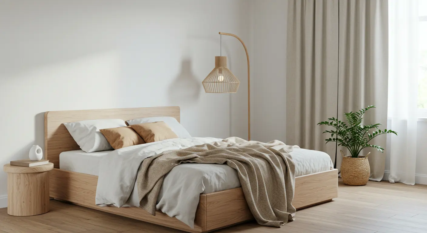
The minimalist bedroom should convey tranquility and comfort. Opt for a soft palette, such as beige or light gray, and complement it with pleasant-to-touch fabrics: cotton curtains, linen bedspreads, and textured throws.
Tip: warm and earthy colors can be introduced in small details, like pillows or a discreet painting, further warming the space.
Functional and Light Kitchen
In the kitchen, light colors visually expand the space and reinforce the idea of cleanliness and organization. Combine white or off-white on the walls with details in wood or light stone on countertops and cabinets.
Avoid strong contrasts. Prefer subtle tonal variations to maintain harmony and the feeling of spaciousness.
Home Office with Focus and Well-being
For the home office, the ideal is a palette that balances concentration and comfort. Light neutral tones create an environment conducive to focus, while discreet touches of earthy colors or objects in natural wood humanize and warm the space.
Plants and natural lighting are also important to reinforce the sense of well-being.
What to Avoid When Using Colors in Minimalism
Despite the creative freedom that minimalist design offers, the inappropriate use of colors can compromise the proposal of balance, lightness, and functionality. Learn about the main mistakes to avoid to maintain a minimalist and cozy aesthetic.
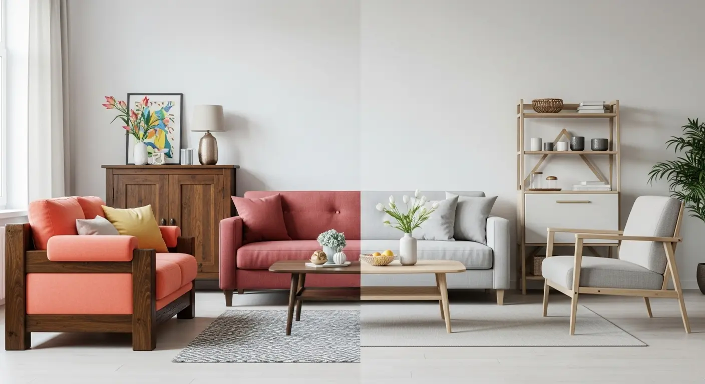
Exaggerations and Abrupt Contrasts
Very sharp contrasts—such as dark walls with light furniture or the combination of several vibrant colors—break the harmony and can cause a feeling of disorder and excess.
Minimalism calls for softness in transitions. Prefer color gradations within the same palette, keeping the environment cohesive and calm.
Very Striking Patterns
Large, flashy, or multicolored patterns can visually clutter the space, undoing the desired simplicity.
In minimalism, if you opt for patterns, choose discreet ones, such as thin stripes or tonal textures, that add interest without overwhelming.
Excessive Use of Cool Colors Without Texture
Although cool colors, like gray or light blue, are common in minimalist design, when applied without the compensation of textures or natural materials, they can make the environment feel cold and impersonal.
The solution is simple: combine cool colors with warm materials, such as wood, natural fibers, and soft fabrics, creating sensory balance.
Checklist: How to Use Colors in Minimalism in a Balanced Way
| Element | Essential Tip |
|---|---|
| Main Palette | Prioritize neutral tones like white, beige, sand, and light gray |
| Touches of Color | Insert in specific objects, such as pillows, paintings, or throws |
| Textures | Combine colors with natural materials to warm the environment |
| Small Environments | Prefer light colors to enhance the sense of space |
| Style | Maintain visual unity between furniture, walls, and decorative objects |
| Patterns | Opt for discreet and monochromatic patterns |
| Color Transitions | Avoid abrupt contrasts; prefer smooth gradations |
| Cool Colors | Always balance with warm textures to avoid coldness |
Conclusion: Color, Simplicity, and Comfort
Knowing how to use colors to create minimalist and cozy environments is the key to transforming your home into a space that promotes well-being, clarity, and beauty with intention.
By working with neutral palettes, natural textures, and subtle touches of color, you avoid excess and create interiors that are welcoming, without sacrificing elegance and functionality.
Minimalism is not the absence of color, but rather the art of using the right colors, in the right places, with purpose and balance.
How about starting now? Choose a room, rethink your palette, and see how small changes can make all the difference in the atmosphere of your space.
If you liked these guidelines and want to advance even further in transforming your space, we also recommend reading 10 Minimalist Interior Design Tips to Maximize Small Spaces. A practical guide for those who want to combine style, functionality, and purpose, even in smaller spaces.